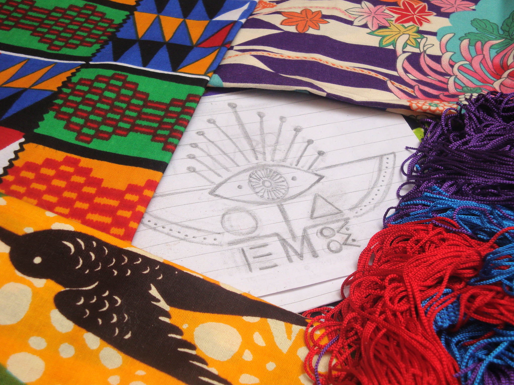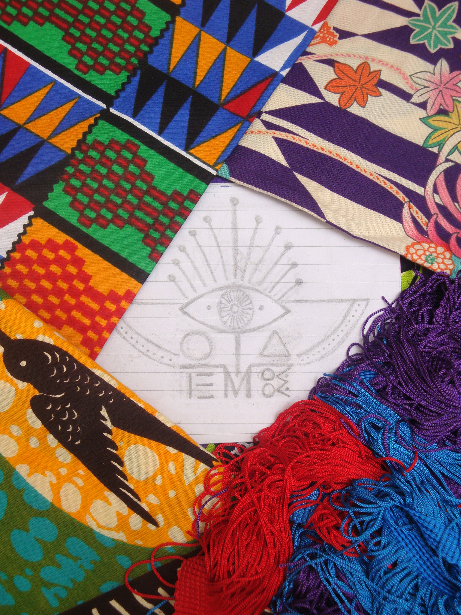
A while ago I was talking in previous posts about how important is for me conceptual art which embraces every single detail of one’s work. Being able to translate graphically a ‘brand”s spirit through its main identity symbol, was not less of hard to conceive. Having ideas way too clear and not really matching a couple of proposals I was provided, I finally decided that no one could shape it better than the person they were coming from. Key concepts apart from totem and taboo, were the reflection between both words, vision, and liberation. I finally managed to create a logo that folded in the middle has both words mirroring each other.


